Hotel PMS — 4 layout directions
Identical palette, identical type scale, identical data in all four. Colour is
not a variable here. What differs is the information architecture: what the home
screen is, how you find a guest, and where the work actually happens.
Same scenario in every shot so they are comparable:
14:20, Selasa 12 Sep. Budi Santoso has walked up to check in (H7K2-9QRT, room
302). The WAN has been down 2h14m. 12 arrivals and 8 departures today, and
there are 3 things needing attention.
Judge them on one question: which one gets a receptionist through that check-in
fastest, and which one would you still like on day 400?
A · Timeline Canvas — the grid is the application
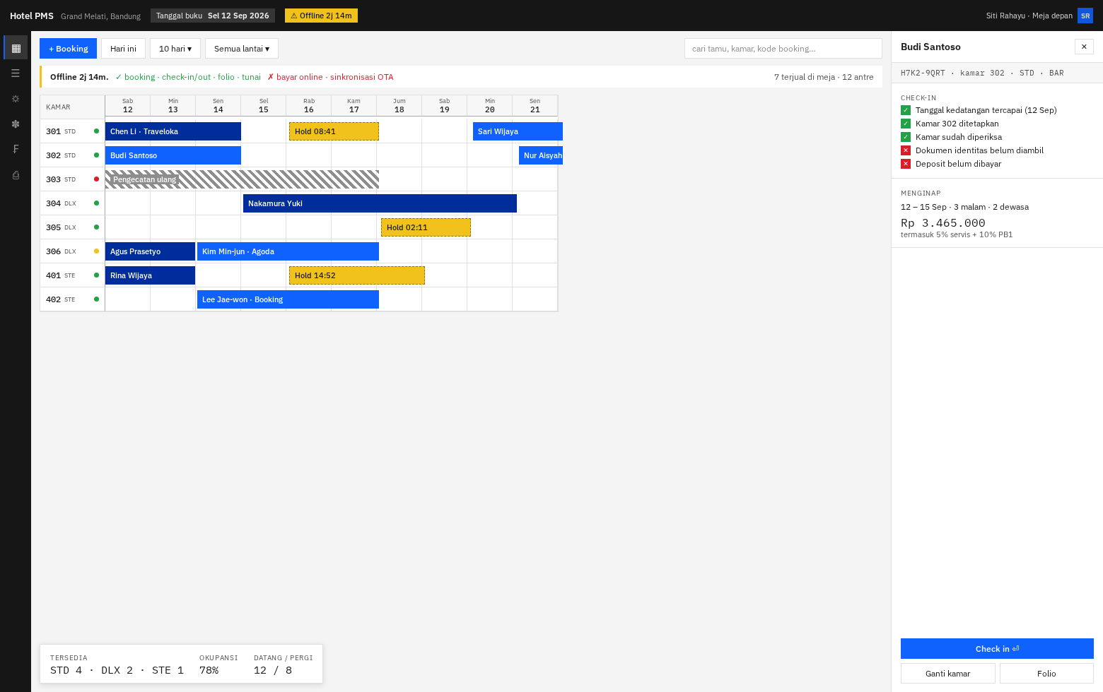
There is no page navigation. A 44px icon rail replaces the sidebar; the tape
chart fills everything. You click an empty cell to book, click a bar to open the
right drawer, and the drawer is where every action lives. Arrivals and
departures are filters on the grid, not separate screens. Today's numbers float
over the canvas bottom-left.
Mental model: the hotel as a map. You navigate by looking.
Strong: everything stays in spatial context; drag-to-move a booking is
natural; one screen to learn; superb for "what does next week look like".
Weak: every action is a drawer or popover; poor fit for housekeeping and F&B,
who do not think in grids; needs a wide screen; a new hire has no idea what to do
first — the screen shows state, not work.
B · Shift Worklist — a queue of what to do, not a map of where things are
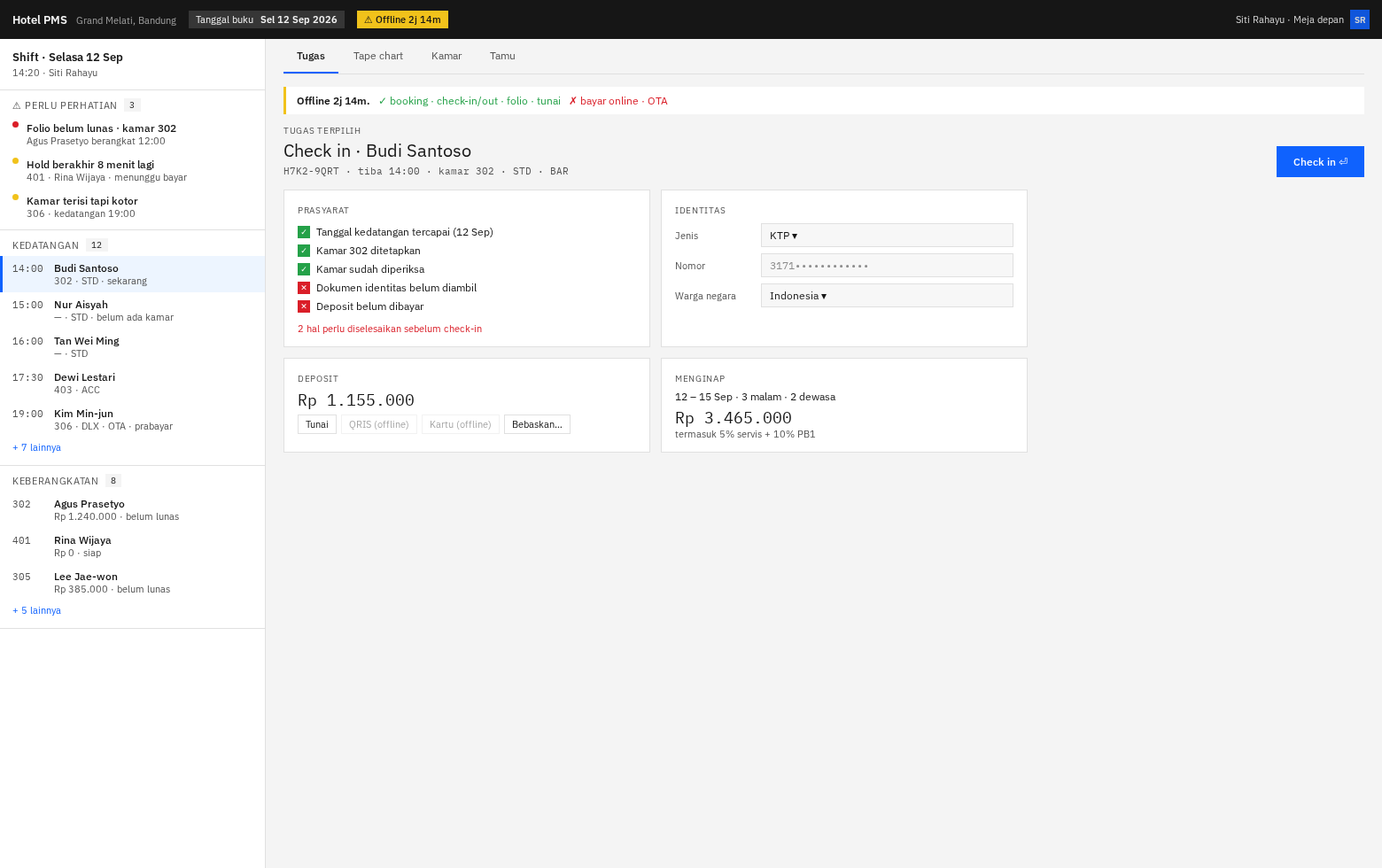
The home screen is your shift: ⚠ Perlu perhatian (3) → Kedatangan (12) →
Keberangkatan (8), in priority order. Click a task, the centre pane becomes
everything needed to finish it — preflight, identity capture, deposit, stay
summary — with one primary button. The tape chart is a tab, not the home.
Mental model: the shift as an inbox. You navigate by working down the list.
Strong: tells staff what to do next, which matters enormously with turnover
and a team that has never used a PMS; exceptions are impossible to miss because
they sit at the top; works on a narrow screen; the offline banner and the
"2 prasyarat belum" hint land where the work is.
Weak: loses the spatial overview experienced staff love; "is 304 free
Thursday?" costs a tab switch; risks feeling like a helpdesk rather than a hotel.
C · Split Console — classic three-pane master/detail
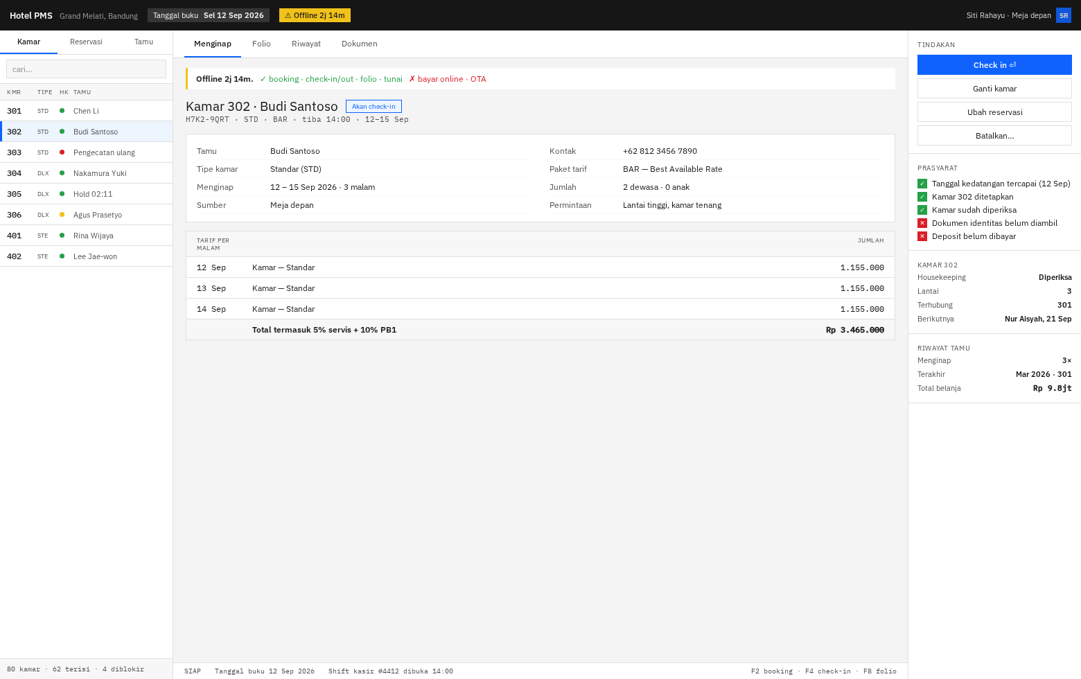
Persistent left list (toggle Kamar / Reservasi / Tamu, searchable), centre detail
with tabs (Menginap · Folio · Riwayat · Dokumen), right rail of actions and
context that never moves. A status bar at the bottom shows business date, cashier
shift, and function keys — the thing every legacy PMS has and every hotelier
recognises.
Mental model: a workstation. Everything is on screen; nothing navigates away.
Strong: instantly familiar to anyone who has used Opera, VHP or Realta —
which matters, because the hotel's staff have used one of those; the right rail
means actions are always in the same place; excellent keyboard flow; the folio
table has room to breathe.
Weak: three panes compete for attention and none is big; needs ≥1440px;
looks like 2009; the least distinctive if you ever sell this as a product.
D · Command First — type what you want; the UI is the result
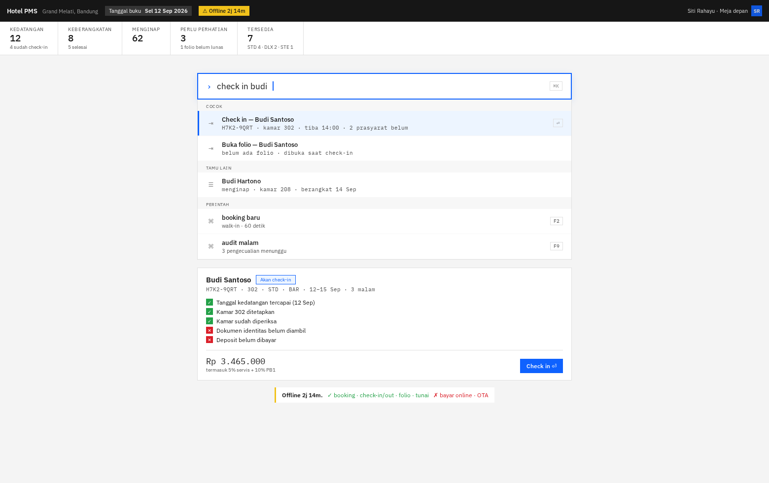
A thin metrics strip is the only permanent chrome. The command bar is the
interface: type check in budi and get ranked results — matched actions, other
guests, then commands with their function keys. Below it, a preview of exactly
what will happen if you press ⏎.
Mental model: a search box that does things.
Strong: by far the fastest for the six things a receptionist does fifty times
a day; the 60-second walk-in target is trivially met; tiny UI surface to build
and maintain; teaches its own shortcuts (F2, F9) as you use it.
Weak: brutal for occasional and casual users — housekeeping and F&B would
need a different interface entirely; discoverability is poor if you do not know
what to type; risky for a hotel with high staff turnover; hard to demo to an
owner, who sees an empty screen.
My recommendation: B, with A as a tab
Two facts about this client drive it:
- Nobody on this team has built a PMS, and the hotel's staff will be learning
a new system. B is the only layout that answers "what do I do now?" without
training. A, C and D all assume you already know. - Offline operation is the product's whole reason to exist. B is the layout
where degraded state is unmissable — the banner sits directly above the task,
and disabled QRIS/card buttons appear exactly where the cashier would reach
for them.
Then put A behind the "Tape chart" tab, because the spatial view is genuinely
better for availability questions and for dragging a booking between rooms — and
B's tab bar already has the slot. That is not a compromise; the two answer
different questions and B's shell holds both.
C is the safe pick if the hotel's staff are Opera/VHP veterans and you want
zero retraining friction — ask them before dismissing it.
D I would not choose as the primary interface, but I would build its command
bar into whichever layout wins. ⌘K over an existing UI is maybe three days and
gives the power-user speed without making it the only door.
Notes on what you are looking at
- Copy is Bahasa Indonesia because
idis the default locale (A-072). - The business-date chip ("Tanggal buku Sel 12 Sep") is permanent in all four
— the business date is not today after a delayed night audit (docs/04§2.3). - Hold bars are hatched with a live countdown: a hold occupies real inventory,
so it must not look like a confirmed booking. - Room 303 is an out-of-order block; blocks share the allocation table with
reservations, which is why they sit in the same lane. - The check-in preflight is server-driven — failing checks sort first and are
actionable in place (docs/07,/reservations/{id}/check-in/preflight). - All four are Carbon underneath. Layout choice does not change the component
library, the tokens, or ADR-009.