Hotel PMS — 4 design directions
Pick one. Same screen, same data, same components in all four — only the design
language changes, so what you are judging is taste, not content.
The screen: the tape chart (room × date grid), which is where the front desk
lives all day, plus the check-in preflight card so you can see how forms read.
Copy is in Bahasa Indonesia because id is the default locale (A-072).
Constraint: IBM Carbon is contractually fixed, so these are four design
languages expressed in Carbon tokens — not four design systems. Any of them is
Carbon underneath; components, spacing scale and type scale are Carbon in all four.
1 · Carbon Canonical
Carbon as IBM ships it — g10 light, Plex Sans, blue-60 accent, square corners.
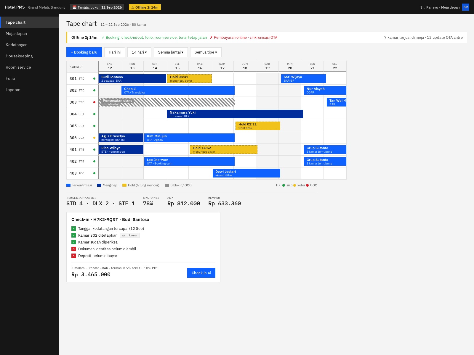
Reads as: enterprise software. Serious, neutral, familiar to anyone who has
used IBM or bank back-office tools.
Best if: you want zero design risk and the fastest build — this is the
default path, no token overrides, upgrades cleanly with Carbon releases.
Against: looks like every other Carbon app. No warmth; a hotel is a
hospitality business and this reads like a logistics console.
2 · Night Desk
Carbon g90 dark. Same structure, inverted surfaces.
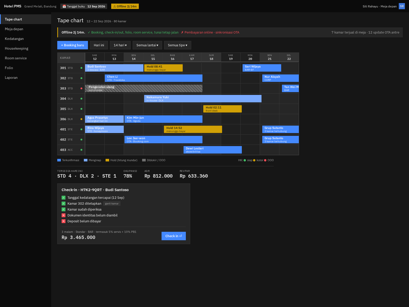
Reads as: an operations console built for people working at 03:00.
Best if: the front desk is staffed 24/7 and the night audit matters — a dark
UI at 3 a.m. is materially kinder than a white one, and the night manager is the
person who runs the audit.
Against: worse in a bright daytime lobby, and printed/screenshotted output
looks odd. Carbon supports both themes, so this could also just be a toggle
rather than the default — my recommendation regardless of which you pick.
3 · Warm Hospitality
Carbon structure, hospitality palette — sand and teak surfaces, deep teal accent,
4px corners, slightly more generous row height.
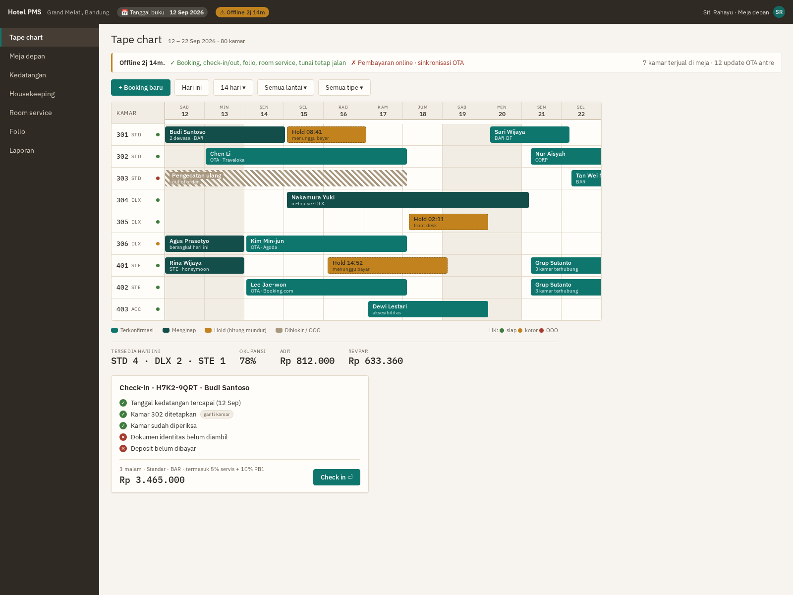
Reads as: a hotel product rather than a bank product. Softer, calmer, still
completely legible and dense enough to work.
Best if: the client cares that it feels like hospitality — and if you ever
sell this to hotel #2, this is the one that looks like a product rather than an
internal tool.
Against: ~2–3 extra days to build and maintain a token override layer, and
every Carbon upgrade needs a quick re-check of the overrides.
4 · Dense Ops
Maximum information density — 28px rows against 40, smaller type, monospace
numerics, more rooms and days visible without scrolling.
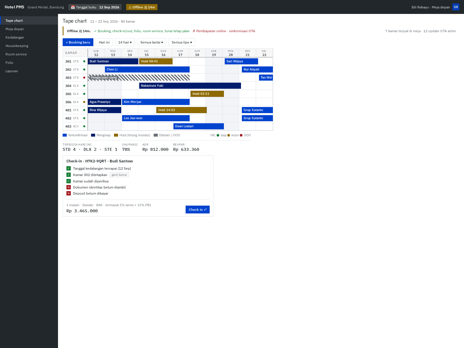
Reads as: a professional tool for someone who uses it 8 hours a day.
Best if: the tape chart is the primary screen and staff are power users. At
80 rooms this fits roughly 40 % more on screen, which is real: fewer scrolls per
booking.
Against: harsher for occasional users, tighter tap targets (bad for the
housekeeping mobile board — that screen would need its own density), and less
forgiving of long Indonesian guest names.
My recommendation
3 (Warm Hospitality) as the default, with 2 (Night Desk) as a user-toggleable
dark theme, and Dense Ops' density borrowed as a per-user "compact" setting
rather than a whole design language.
Reasoning: warmth costs 2–3 days once and is the thing that makes this look like
a product you could sell again; the dark theme is nearly free because Carbon
ships g90 already; and density is genuinely a preference, not a house style —
some staff want it, the housekeeping phone board actively does not.
If you want zero risk and the fastest M1, pick 1 and move on. It is the only
choice with no ongoing token-maintenance cost.
Notes on what you are looking at
- The offline banner is real, not decoration — it names what still works
before what does not, because staff panic at red banners (docs/08§7.1). - The business-date chip ("Tanggal buku 12 Sep") is always visible because
the business date is not today after a delayed night audit, and a walk-in at
01:30 must be booked against the open business date (docs/04§2.3). - Hold bars are hatched with a live countdown — a hold occupies real
inventory, so it must look different from a confirmed booking. - Room 303 shows an out-of-order block; blocks share the same allocation
table as reservations, which is why they render in the same lane. - The check-in card is server-driven: failing checks sort first and are
actionable in place.