The Valid PMS mark
Designed 2026-08-25.
What it is
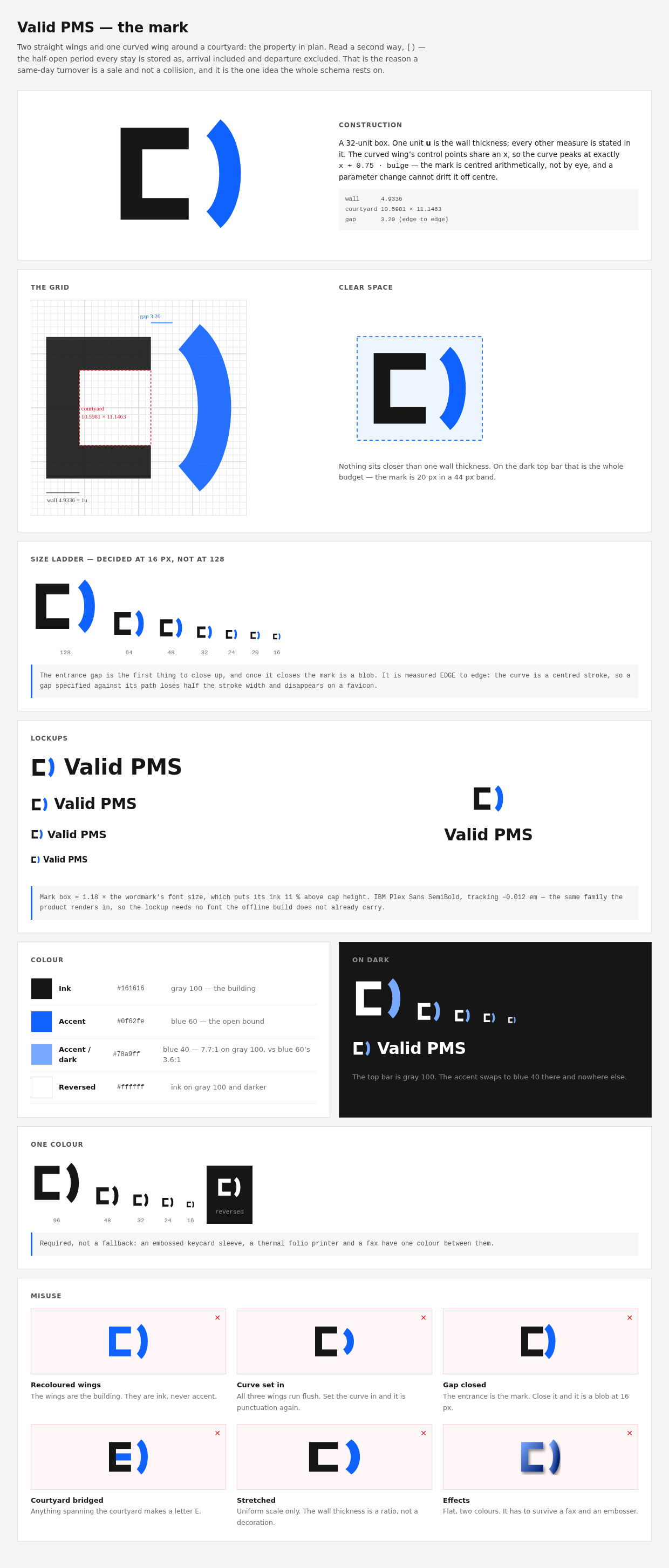
Two straight wings and one curved wing around a courtyard — the property in
plan. The same U whose corridor graph is the reason distance in this system is
a Dijkstra walk and not a straight line.
Read a second way it is [): the half-open period every stay is stored as,
arrival included and departure excluded. That is the reason a departure and an
arrival on the same date do not conflict — same-day turnover is a sale, not a
collision — and it is the one idea the whole schema rests on.
Neither reading has to be noticed for the mark to work. At 16 px it is simply a
distinctive shape; at 128 px it is a building; if you have read docs/03 it is
a date range.
The geometry lives in one place
design/logo-final.mjs holds GEOM and generates everything downstream:
the favicon, the three brand SVGs, the touch icons, and both design sheets.
Change it there or not at all.
The one file it cannot generate is web/src/components/Logo.tsx — a React
component cannot import a build script — so Logo.test.ts pins the component's
path constants against the shipped web/public/favicon.svg. There are five
copies of this drawing in the tree and a logo that drifts does not throw and
does not look broken; it just quietly ships a browser tab that disagrees with
the sign-in screen. Same reason money.test.ts pins the TS formatter against
values generated from the Go one.
| on a 32 grid | |
|---|---|
wall (1u) |
4.9336 |
| courtyard | 10.60 × 11.15 |
| entrance gap | 3.20, edge to edge |
| clear space | 1u on every side |
The curved wing's two control points share an x, so the curve peaks at exactly
x + 0.75 · bulge. That closed form is what lets the mark be centred
arithmetically rather than by eye — a parameter change cannot drift it off
centre, and the clear-space rectangle is derived from the same expression
instead of being fudged to look right.
Colour
| Ink | #161616 |
gray 100 — the building |
| Accent | #0f62fe |
blue 60 — the open bound, the side still sellable |
| Accent on dark | #78a9ff |
blue 40 — 7.7∶1 on gray 100, against blue 60's 3.6∶1 |
| Reversed | #ffffff |
ink on gray 100 and darker |
The component draws the wings in currentColor, so one component serves the g10
sign-in card and the gray-100 top bar with no variant prop — the mark takes the
ink of the text beside it. The accent cannot do the same, so .pms-top overrides
--pms-logo-accent to the dark-surface accent. That override is the only place
in the product the accent changes.
Blue 60 on gray 100 is 3.6∶1 — it clears WCAG's 3∶1 floor for a graphical
object, so this is headroom rather than a violation. But the curve is a 2.5 px
stroke at top-bar size and 3.6 is the whole budget; blue 40 is 7.7∶1, which is
why Carbon's own dark themes use it as the interactive colour.
One colour is a requirement, not a fallback: an embossed keycard sleeve, a
thermal folio printer and a fax have one colour between them.
Where it appears
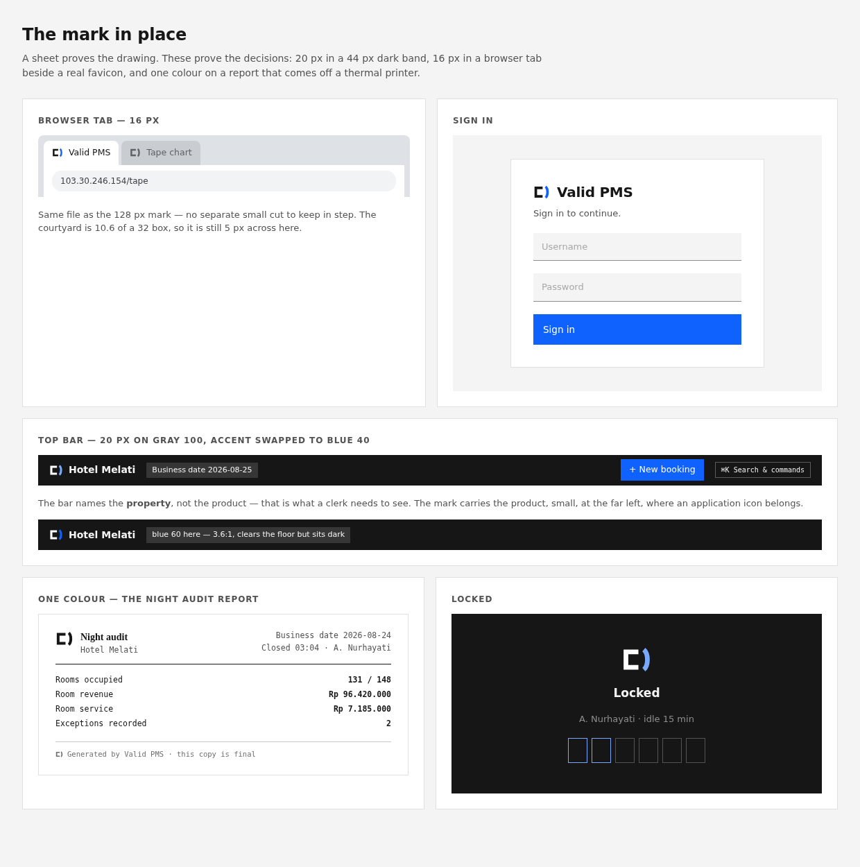
- Browser tab, 16 px —
web/public/favicon.svg, the same file as the 128 px
mark. No separate small cut, because a second file is a second thing to keep
in step and the courtyard survives 16 px without one. - Sign in, as the lockup — mark plus wordmark.
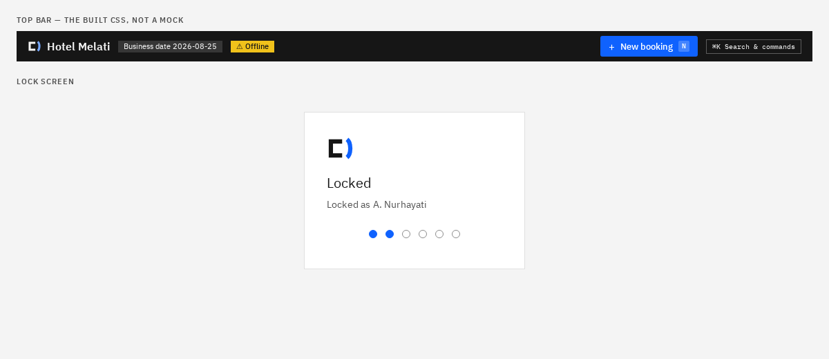
- Locked, 40 px, on the heading's axis.
- Top bar, 20 px in a 44 px band. The bar names the property, not the
product: that is what a clerk needs to read. The mark carries the product,
small, at the far left, where an application icon belongs.
The favicon ships inside the Go binary — Vite copies web/public/ into
dist/, which web/embed.go embeds. No CDN, for the same reason the fonts are
self-hosted: a UI that loses its identity the moment the WAN drops fails the
product's defining requirement on the most visible axis available.
What was tried, and what killed it
Every rejection below was legibility, not taste, and each one is now a rule.
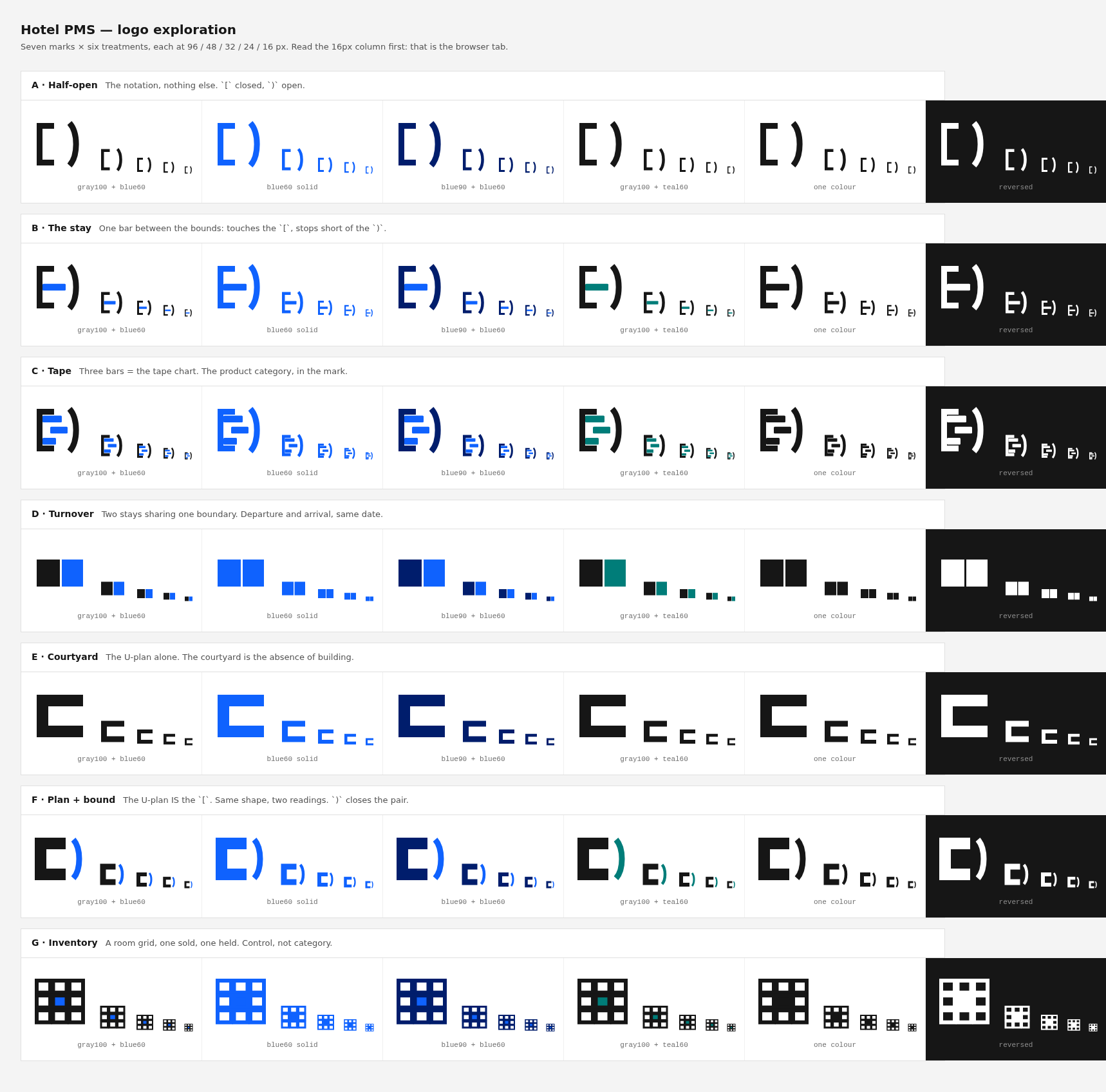
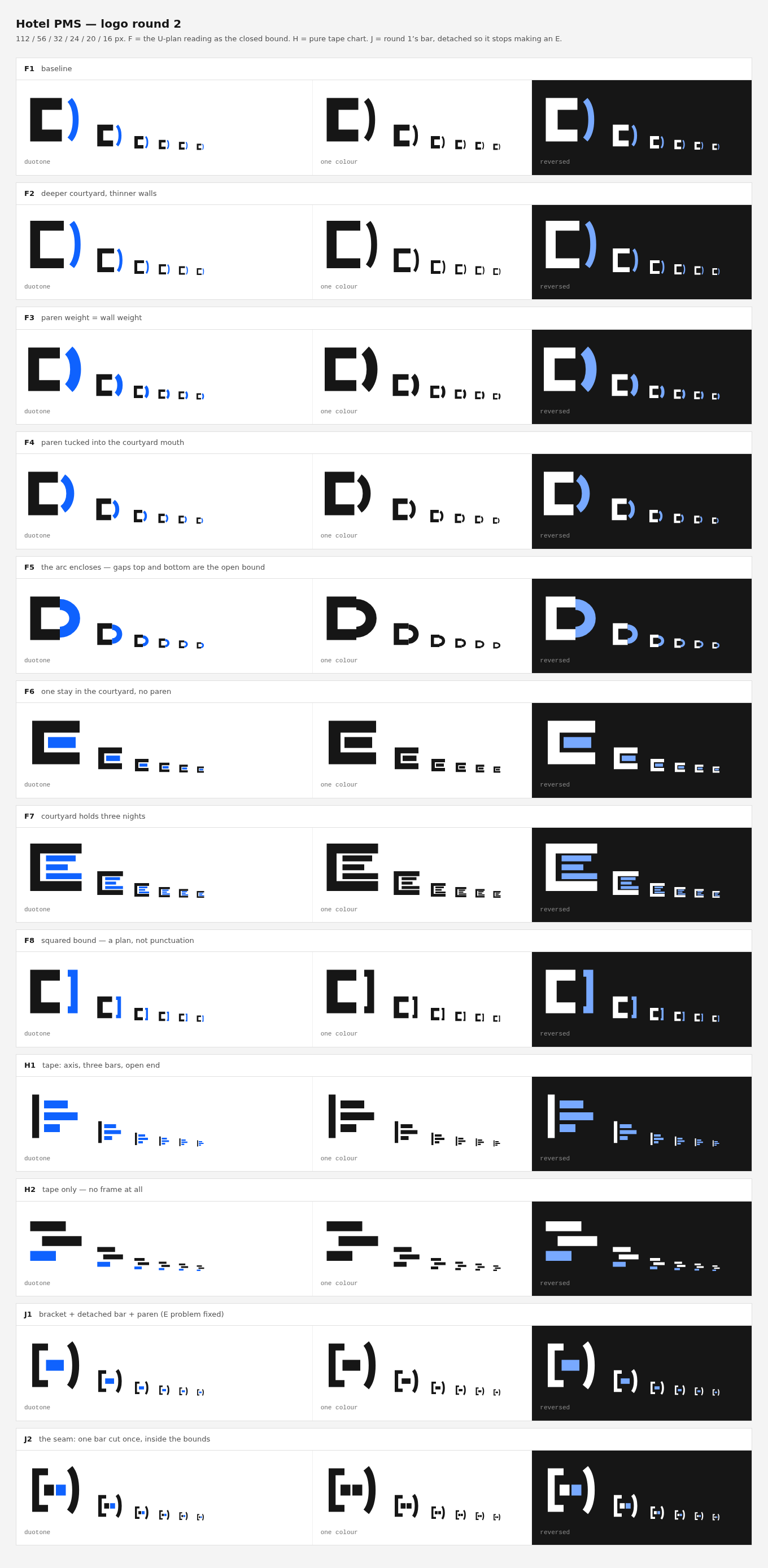
| A bar touching the bracket stem | Makes a letter E. Killed two candidates. Nothing may span the courtyard |
| Closing the curve into an arc | Makes a letter D |
| The U alone | Makes a letter C |
| Setting the curved wing shorter than the straight ones | Turns a building back into punctuation. All three wings run flush |
| A detached bar between the bounds | At 16 px reads (-) |
| A room grid; two abutting blocks; an axis with bars | Generic. "Analytics", or nothing at all |
And the measurement mistake worth remembering: the entrance gap is measured
edge to edge, not path to path. The curved wing is a centred stroke, so a gap
specified against its path loses half the wall width — a nominal 3.0 is really
0.75, and it closes up at favicon size. The first version of this mark was a
blob in a browser tab and looked perfect at 128 px.
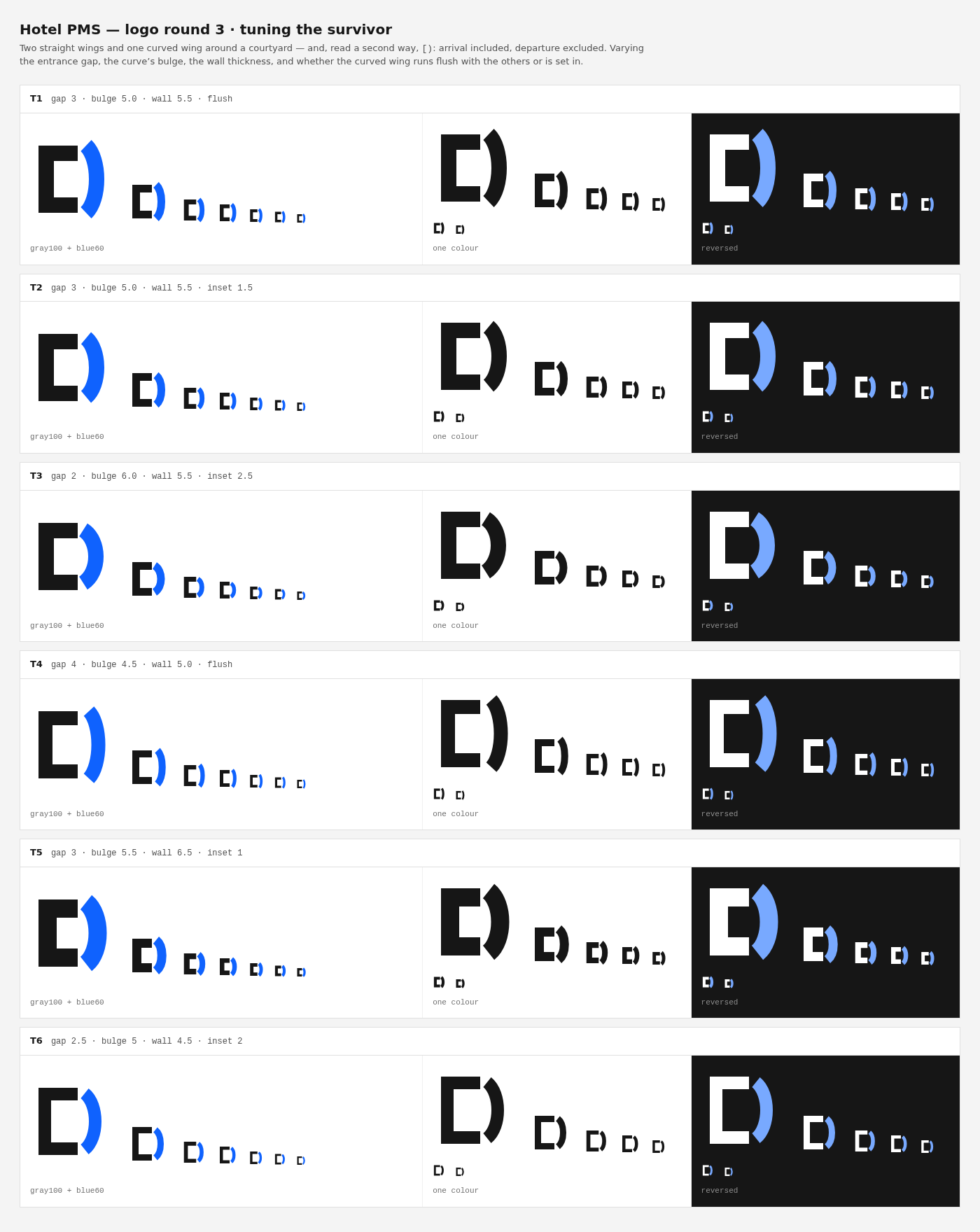
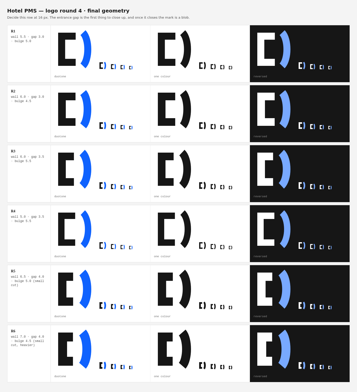
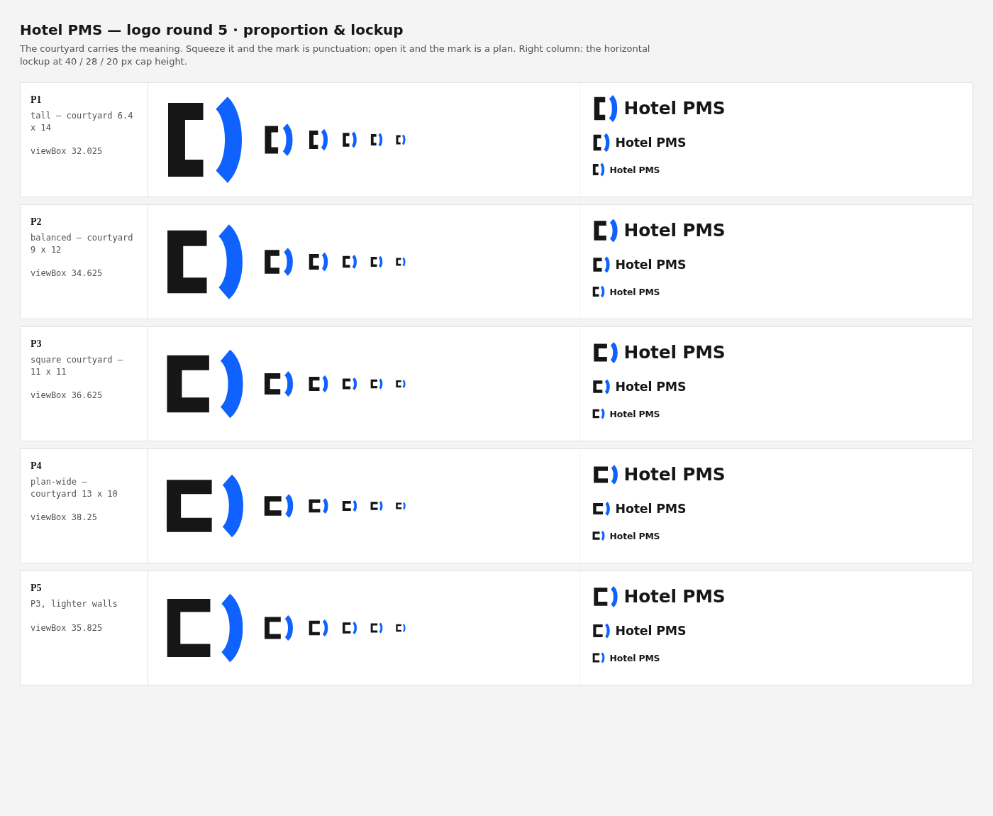
The rounds are kept — design/logo-round1.mjs … logo-round5.mjs, rendered to
design/shots/logo-round*.png:
| Round 1 | seven concepts × six treatments. Four die here |
| Round 2 | eleven refinements. The E, the D and the (-) |
| Round 3 | flush vs. set-in — building vs. punctuation |
| Round 4 | weight and gap, decided at 16 px |
| Round 5 | proportion. The courtyard has to be roughly square |
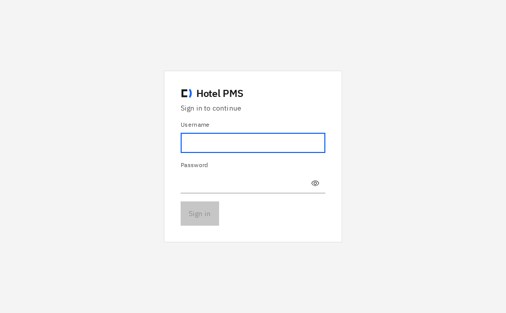
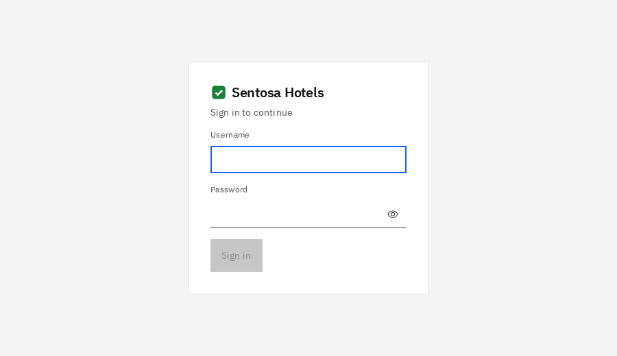
And the two screenshots that matter, taken from the built CSS rather than a
mock: sign in · top bar and lock.
Files
design/logo-final.mjs      GEOM + generators — the source of truth
design/logo-sheet.mjs      → out/logo-brand.html   (construction, ladder, misuse)
design/logo-insitu.mjs     → out/logo-insitu.html  (tab, sign-in, top bar, report)
design/logo-round[1-5].mjs the explorations, dead ends included
web/public/favicon.svg     the tab, and the SVG everything else is checked against
web/public/brand/          mark.svg · mark-mono.svg · mark-reversed.svg · icon-{180,512}.png
web/src/components/Logo.tsx  <Logo> and <Lockup>
web/src/components/Logo.test.ts  the anti-drift pin
Re-render everything with ./design/render.sh.
The artefacts, served: mark · mono · reversed · favicon · touch 180 · 512




White labelling
The product ships as Valid PMS and a reseller replaces all of it without a
rebuild. Four environment variables, read once at boot
(internal/platform/brand, documented in docs/09 §4.1):
PMS_BRAND_NAME |
the wordmark, the browser tab, the pmsctl banner |
PMS_BRAND_ACCENT |
the accent on light surfaces |
PMS_BRAND_ACCENT_DARK |
the accent on the gray-100 top bar |
PMS_BRAND_MARK |
an SVG that replaces this mark entirely |
The binary rewrites index.html as it serves it rather than the SPA fetching
its own identity. Two reasons, and both show up as a visible flash: the browser
tab's title is set before React exists, and the sign-in screen is the first
thing painted — a deployment that shows the vendor's name for 200 ms has leaked
it. web/index.html carries a <script id="pms-brand" type="application/json">
tag holding the compiled-in defaults, which is what vite dev renders and what
the binary replaces.
Three things that fell out of building it:
/resolves to a real file, so it took the static path and served the RAW
index.html. Every deep link was branded correctly and the front door was
not — the single most requested URL in the product. Found by testing against
the built SPA rather than a fixture.- The shipped SVGs had
aria-label="Hotel PMS"baked in. They are
referenced as images, where the accessible name belongs to the element doing
the referencing — so the label bought nothing and put the vendor's name
inside an asset a white-label deployment serves. - Reading the marker at module load touched
document. Anything without a
DOM — a node-environment test, a script — failed on merely importing the
Logo.readBrandresolvesdocumentlazily now.
The mark is name-agnostic by construction: <Lockup> takes its wordmark from
config, so a new name changes one environment variable and nothing else.
An operator's SVG is served with Content-Security-Policy: default-src 'none'
and nosniff, and rendered through <img>. An SVG is a document and can carry
script; a reseller handing over a logo is not a reason to hand them a
same-origin script vector.